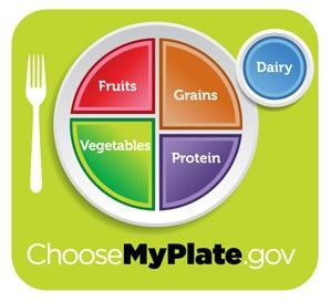
Say goodbye to the trusty nutrition pyramid and say hello to the user-friendly ChooseMyPlate campaign. Today, the USDA replaced the traditional nutrition pyramid with this updated plate graphic— and the difference is huge.
Red, Green, Purple, Blue, and Gold Plated – Analysis
The new image, called MyPlate (over MyPyramid), is aimed at presenting the basics of a healthy diet in a clear and easy-to-decipher way. The plate icon is sliced into four wedges: fruit, veggies, grains, and protein, and a small circle to the side for dairy. The vegetable and grains wedges appear equal, as do the (slightly smaller) fruits and protein wedges.
So why the big shift? Health professionals struggled with the food pyramid structure for years because it failed to distinguish between healthy choices (think: fish and brown rice) and unhealthy ones (think: sausage and white bread). The idea is that a clearer graphic (like the new plate) will force people to take a visual cue as to how much of each food group should be on your plate plus stress the importance of fruits and vegetables (which take up half of the graphic).
The new USDA campaign emphasizes the importance of smaller portions and taking time to enjoy eating. Another step forward? The new suggestions include making at least half the daily dose of grains whole grains, switching to fat free or low fat dairy products, reducing sodium intake, and replacing sugary juices and sodas with water.
Experts’ Take
Jason Edmonds:
I agree that the new USDA icon, “My Plate” offers a more user friendly visual aid to eating a wholesome, nutritious diet. I find it interesting that the new icon also differs from “My Pyramid” in that it offers nutritional guidance on the basis of constructing individual meals as opposed to planning the total servings per day of various foods.
I would also like to see the USDA offer more guidance for those with higher activity levels. For example, if someone takes up a strength training regimen, should that person actively increase protein intake at some point? What about for someone who runs 10 miles per week? Should that person make an effort to eat more whole grains? Currently there seems to be various different opinions regarding these matters. It would be nice to have some general reference points based upon solid research, even if the subject remained contentious within the physical/athletic culture.
Matt Delaney:
My response to that plate is that the grains portion may be too much. Grains can create inflammation in even those who have no apparent gluten allergies. I also don’t think all proteins are equal. Freshly caught wild Alaskan salmon is going to be a lot healthier than meats that contain hormones and may have been from sick corn fed cattle. Maybe a list of super-foods in each category can help identify which foods in each category have unique benefits? For instance quinoa is considered by some to be a grain but is rich in iron and protein and in my opinion is much healthier than wheat.
TL;DR
Pyramids are out, plates are in. USDA replaced the food pyramid with a user-friendly plate icon to make filling your plate with healthy foods easier.

